e-comm marketplace
background
FedEx Office is known for printing — flyers, postcards, banners, signage — for consumers and small businesses. Leadership sought to expand into a new e-commerce marketplace, built in partnership with Canva, where customers could design and print customizable promotional products in one place.
The strategic question wasn't just what to build. It was how to make a print company feel like a creative destination.

RESEARCH
The project began with a foundational question posed to FedEx Office customers:
"Before deciding what to design and print, where do you go for inspiration?"
52% pointed to Pinterest — across both merchant and consumer segments. That single finding reframed the design challenge: the marketplace didn't need to feel like a print shop. It needed to feel like a place to start.
From there, research expanded into how customers mentally organized print products — what categories felt intuitive, what language resonated, and how people moved from a vague creative need to a specific purchase decision.
My Role
I led the agency design of the FedEx Office marketplace, envisioning what inspiration-driven shopping could look like for new and existing customers. Three design opportunities were built— including card sorting and information architecture for the mega menu — translating customer mental models into a navigation structure built for discovery.
Experience Flow
The homepage was designed around browse ability rather than transaction. Taking cues from Pinterest's familiar grid format, the layout invited customers to wander — surfacing curated product ideas, videos, and editorial content alongside shoppable items. The goal was a space that rewarded return visits, not just conversions.
The experience was designed to serve two distinct user modes at once:
The purposeful buyer — someone who knows what they need and wants a direct path to it
The inspired browser — someone who arrives with a vague creative need and needs the site to surface the right idea at the right moment
Filter options supported both: seasonal selections, industry-specific themes, blog content, and available discounts gave browsers a way to narrow without committing, while clear navigation served customers ready to purchase. A dedicated pathway also highlighted local graphic designers, connecting customers to creative services within the FedEx Office ecosystem.
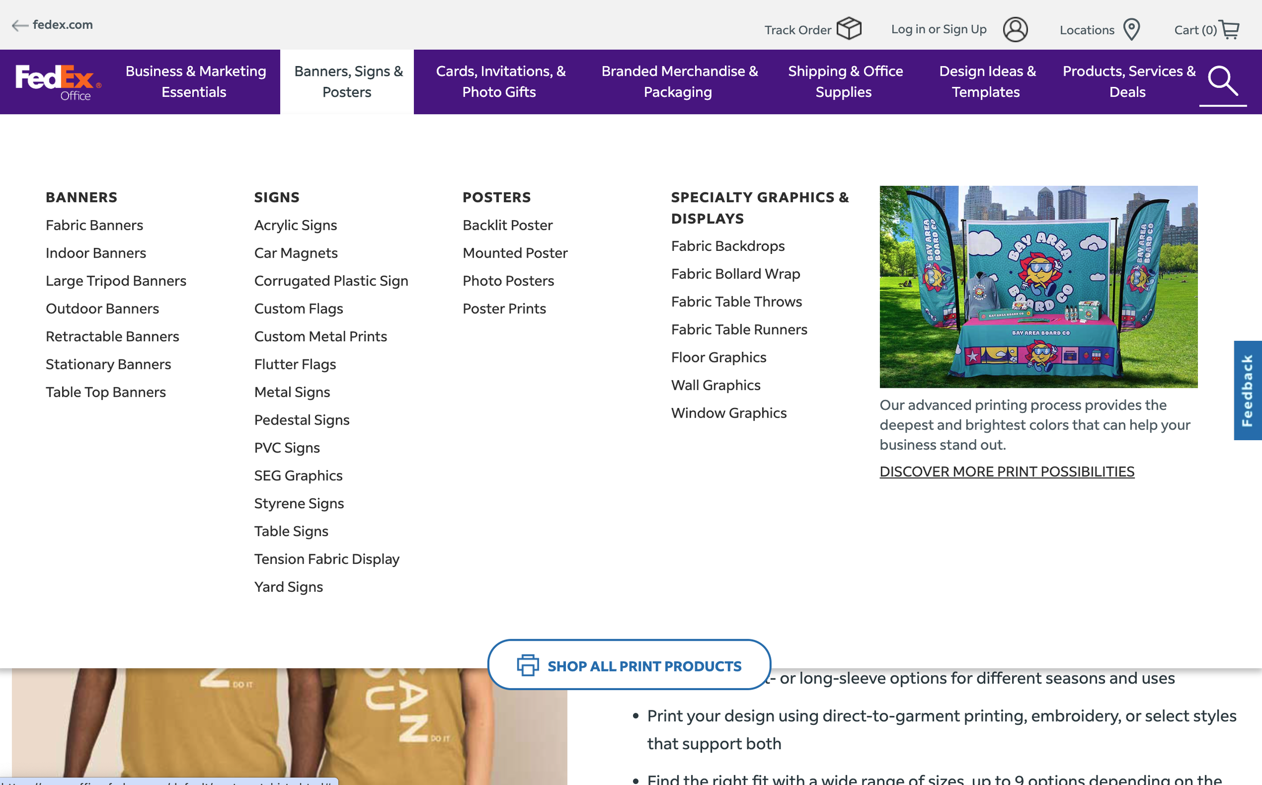
Navigation Architecture
One of the most research-intensive parts of the project was the mega menu. Card sorting sessions with customers revealed how people naturally grouped and named print products — often differently than internal teams expected. Those mental models became the foundation for the menu's category structure.
The result was a navigation system that let customers explore ideas directly within the menu itself, before landing on a dedicated category page. Inspirational photography was paired with each category, reinforcing the browsable, creative tone of the overall experience rather than defaulting to a utility-first structure.

OUTCOME
Three distinct design concepts were developed and tested with customers, stress-testing different approaches to inspiration, navigation, and product discovery. The final direction — validated through research and refined through collaboration with a team of designers and researchers — brought a cohesive experience to life that positioned FedEx Office not just as a print vendor, but as a starting point for creative work.
